UX Research, UI Design, Content Design
UX Research, UI Design, Content Design
UX Research, UI Design, Content Design
UMBC Library Website
UMBC Library Website
Overview
In spring 2023, my teammate and I assessed UMBC’s A.O.K. Library website. We analyzed users' needs and pain points to find solutions. Visualized solutions were then proposed to UMBC library staff.
Overview
In spring 2023, my teammate and I assessed UMBC’s A.O.K. Library website. We analyzed users' needs and pain points to find solutions. Visualized solutions were then proposed to UMBC library staff.
The Problem
The University of Maryland, Baltimore County (UMBC) has an extensive academic resource database in the A.O.K. Library. Navigating through their abundant information can prove challenging. Students rely on the library website for essential academic resources, including study room reservations. Streamlining navigation and reducing cognitive load will improve users' usability and help utilize UMBC databases efficiently.
Design Process

EMPATHIZE
Interviews and Observations
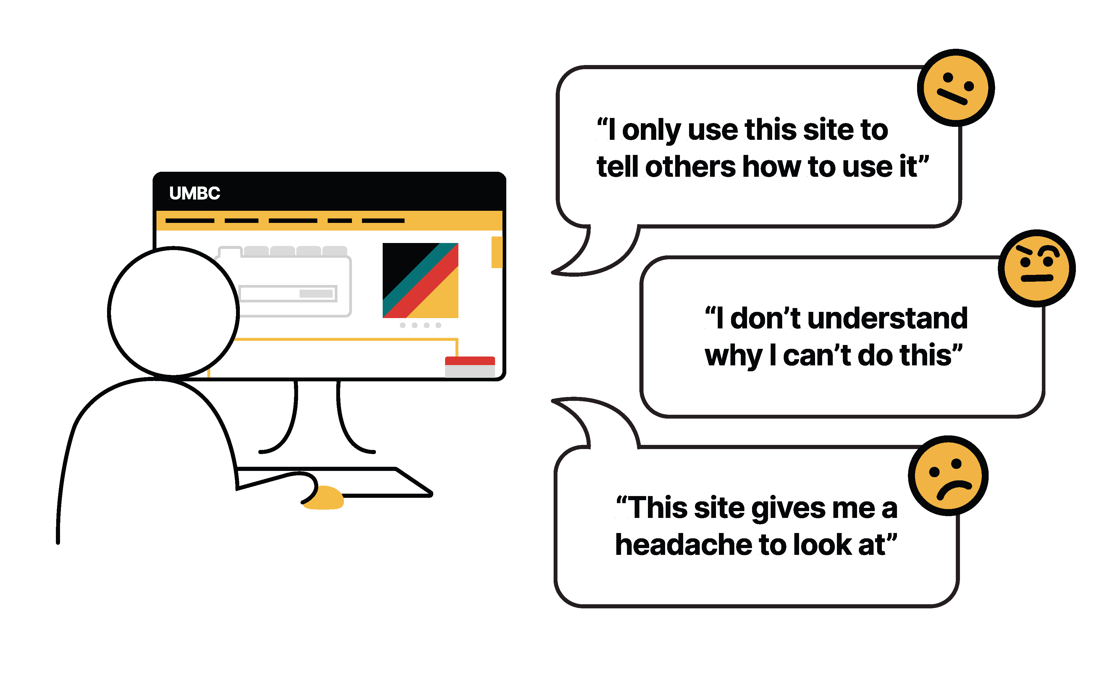
Three students and three staff members analyzed the A.O.K. library site navigation. After observing, we asked users semi-structured questions to reflect on their experiences. The following are a few notable comments interviewees made:
"It's annoying to find the study spaces, so I made a bookmark to skip the main page."
"I only use this site to tell others how to use it."
"The site has a lot of information, but I don't think I absorb even half of it."
Interviews and Observations
Three students and three staff members analyzed the A.O.K. library site navigation. After observing, we asked users semi-structured questions to reflect on their experiences. The following are a few notable comments interviewees made:
"It's annoying to find the study spaces, so I made a bookmark to skip the main page."
"I only use this site to tell others how to use it."
"The site has a lot of information, but I don't think I absorb even half of it."
DEFINE
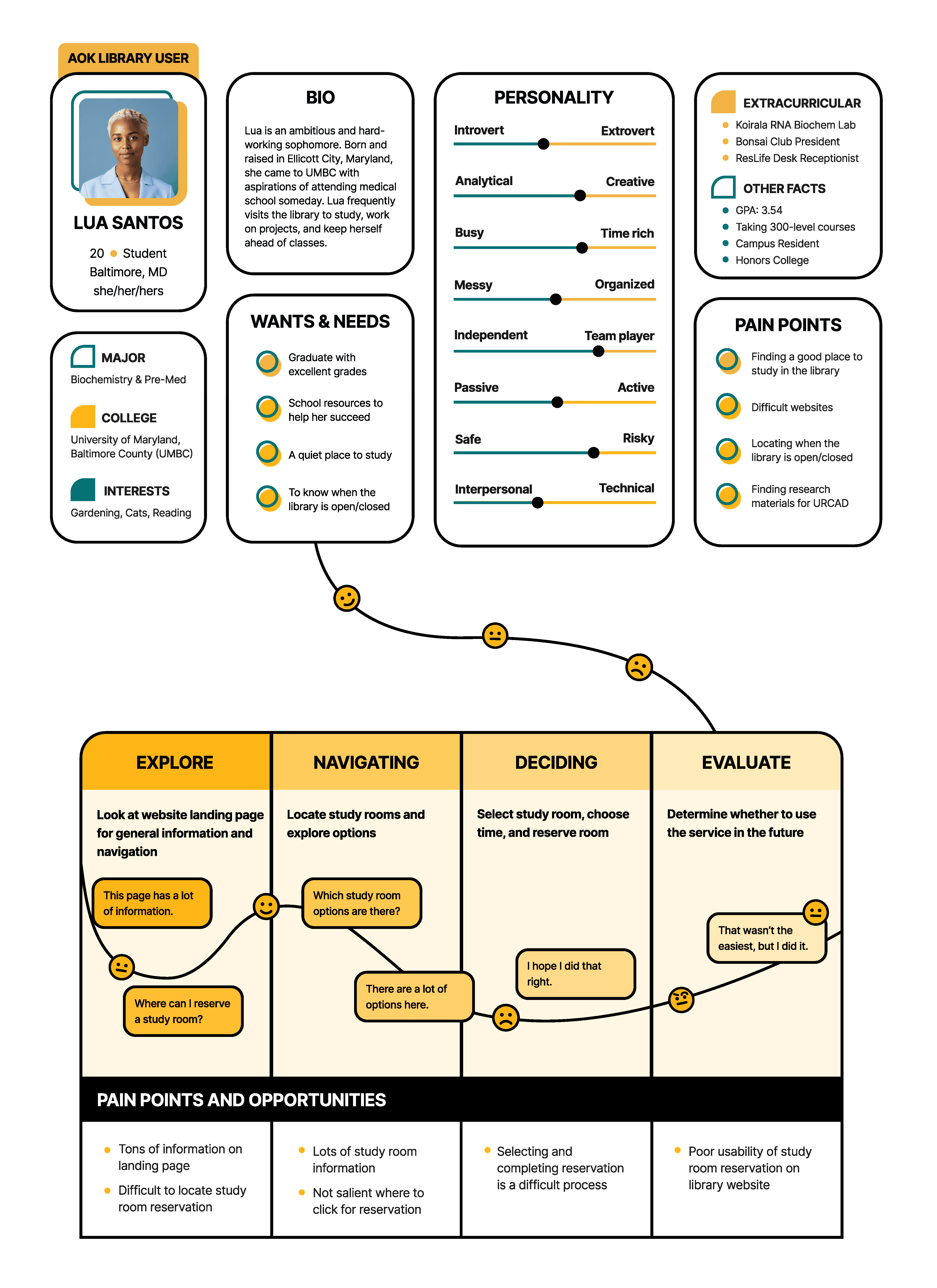
Personas and User Journeys
During observations, users often expressed being overwhelmed when initially engaging with the website. Information overload, lack of clear guidance, and absence of prominent features hindered their progress. Notably, frequent users of study room reservations bookmarked pages for efficiency.
Library staff feedback showed they rely solely on the website to help other students. These insights underscore the importance of enhancing the website's usability for students and staff.
DEFINE
Heuristic Evaluations
Further usability evaluations were conducted through heuristics with users. The evaluations uncovered subtle usability issues that user testing might miss. They provided insights on user interactions and anticipated challenges. The process established pivotal characteristics for an effective interface.
Heuristic Evaluations
Further usability evaluations were conducted through heuristics with users. These evaluations revealed nuanced usability issues that may not have surfaced solely through user testing. They offered valuable insights into user interactions with the interface and anticipated challenges they might encounter. This process contributed to establishing a collective understanding of the pivotal characteristics necessary for an effective interface.
Competitive Analysis
We conducted a detailed analysis of five universities to understand how their library websites are organized and navigated:
University of Maryland (UMD)
University of Denver (DU)
Williams College
Towson University (TU)
Virginia Commonwealth University (VCU)
Competitive Analysis
We conducted a detailed analysis of five universities to understand how their library websites are organized and navigated:
University of Maryland (UMD)
University of Denver (DU)
Williams College
Towson University (TU)
Virginia Commonwealth University (VCU)
User Problems
Unable to easily find initial study room reservation selection
Time-consuming task to reserve a space
Room information unclear and cluttered
Hours lacked hierarchy and felt "dumped"
Events, news, printing hidden at bottom of landing page
Filters were unnoticeable
Unable to unselect room reservation once selected
Key Takeaways
Cluttered interfaces were preventing discoverability and limiting navigation.
Inconsistent and incohesive interactions caused confusion and frustration.
Users desired an easy-access, streamlined reservation process
Key Takeaways
Cluttered interfaces were preventing discoverability and limiting navigation.
Inconsistent and incohesive interactions caused confusion and frustration.
Users desired an easy-access, streamlined reservation process

IDEATE & TEST
Low-Fidelity
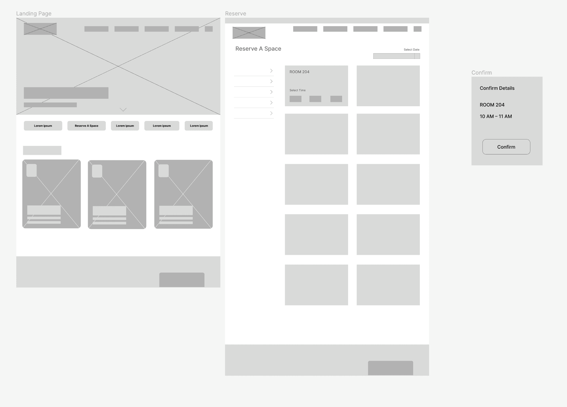
Our research showed the need for a simple solution that helped users achieve their goals. I created a wireframe/low-fidelity Figma prototype to address key takeaways. Then, I tested it with 3 users. The following are some adjustments I made for the medium-fidelity:
Include a final feedback screen after clicking reservation confirmation
Allowing drop-down for extra time slots
Including photos with room cards
Low-Fidelity
Our research showed the need for a simple solution that helped users achieve their goals. I created a wireframe/low-fidelity Figma prototype to address key takeaways. Then, I tested it with 3 users. The following are some adjustments I made for the medium-fidelity:
Include a final feedback screen after clicking reservation confirmation
Allowing drop-down for extra time slots
Including photos with room cards
Just the Essentials
As part of this process, we greatly reduced the cognitive load on users, particularly with microcopy.
Short, concise wording
Informational, straightforward tone
Removing unnecessary language; simplify
Examples:
Reduce room reservation from a paragraph to one sentence
Place action words (Places to Study->Reserve A Space)
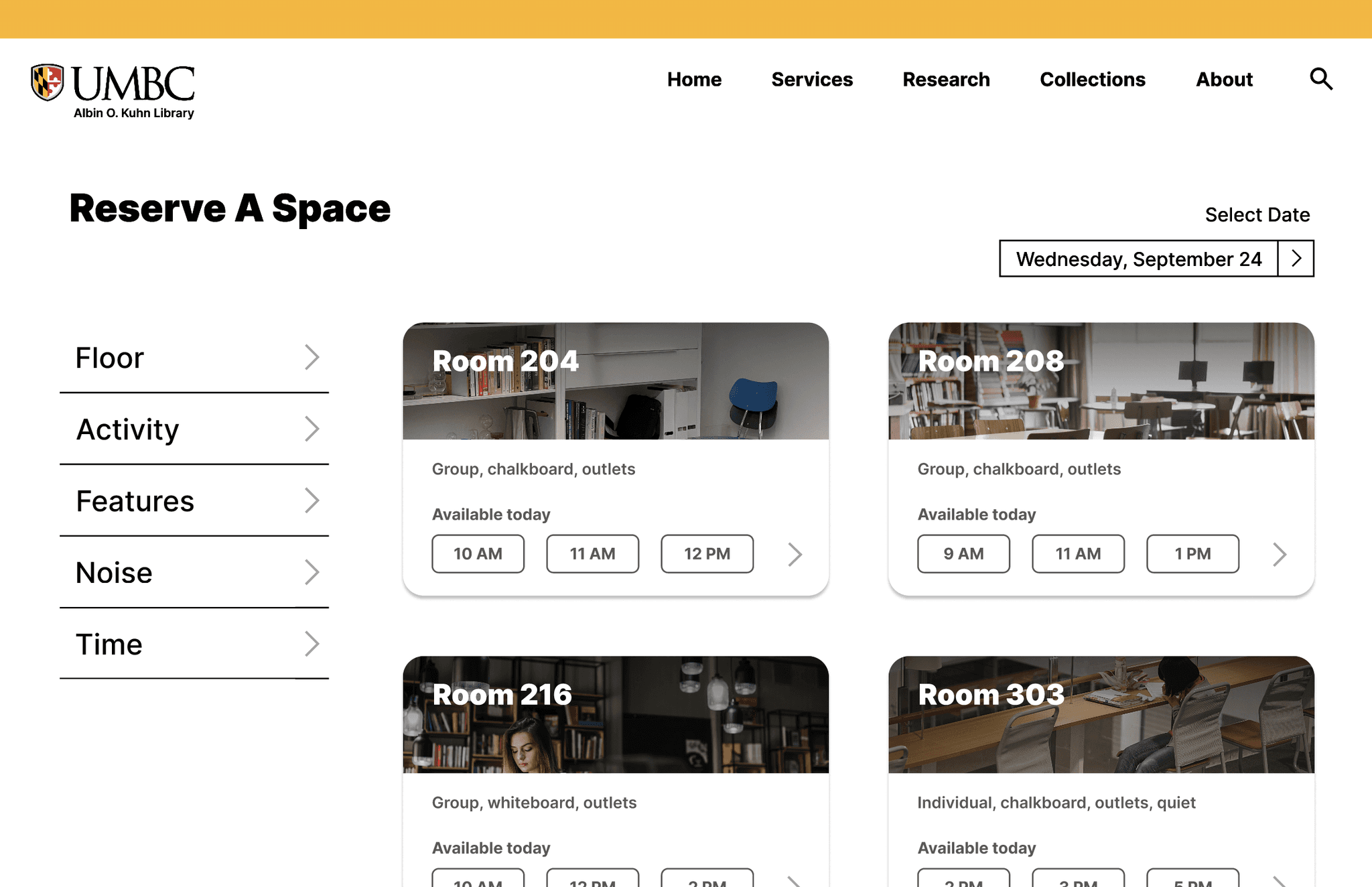
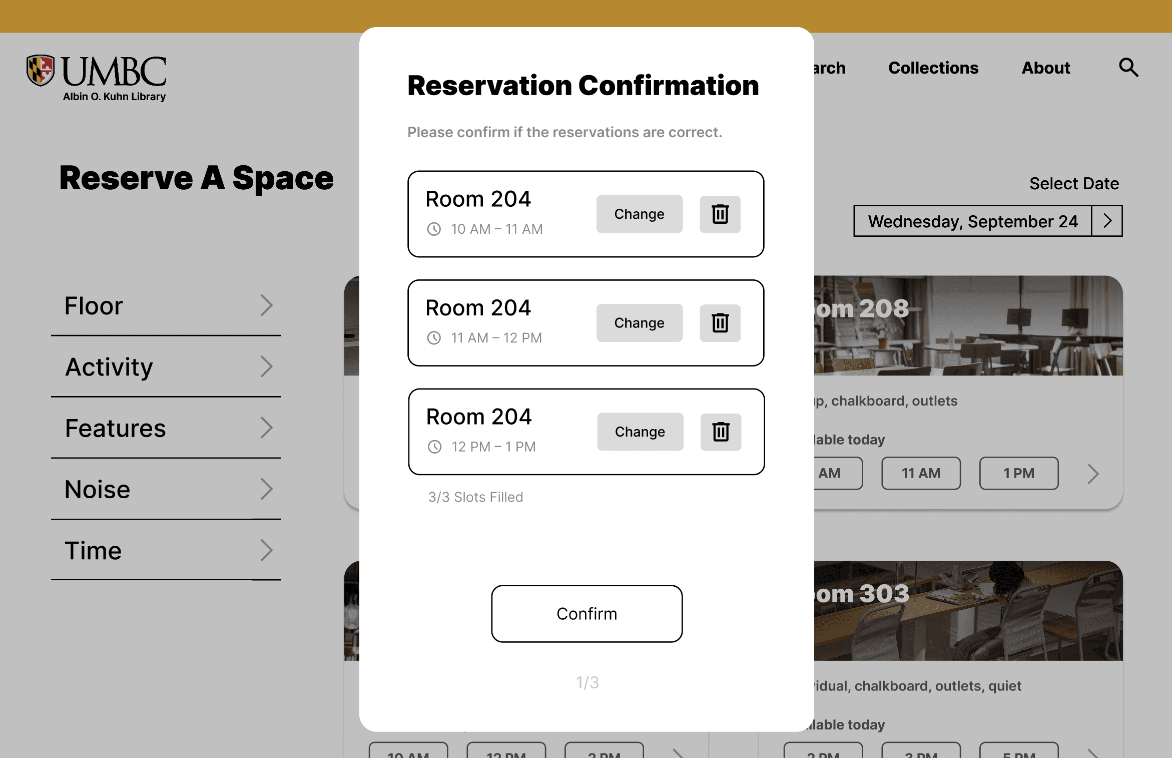
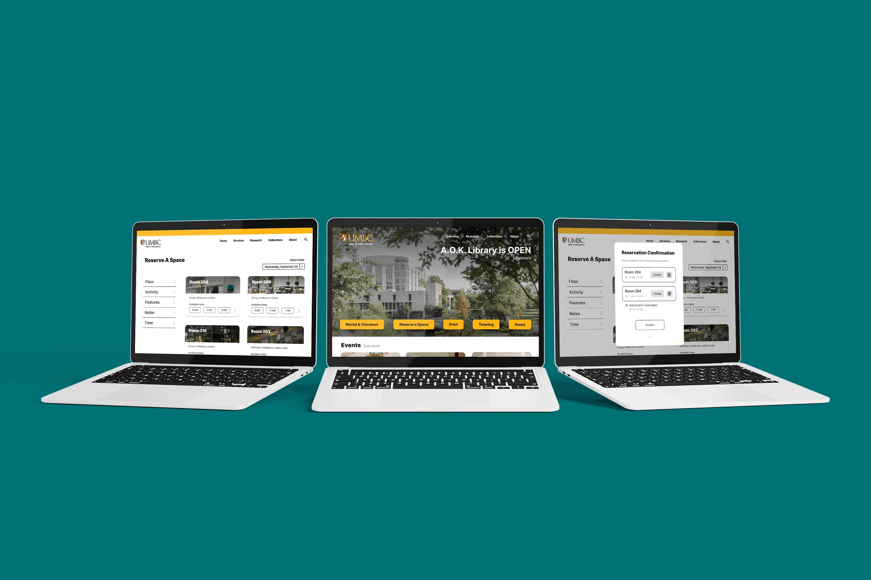
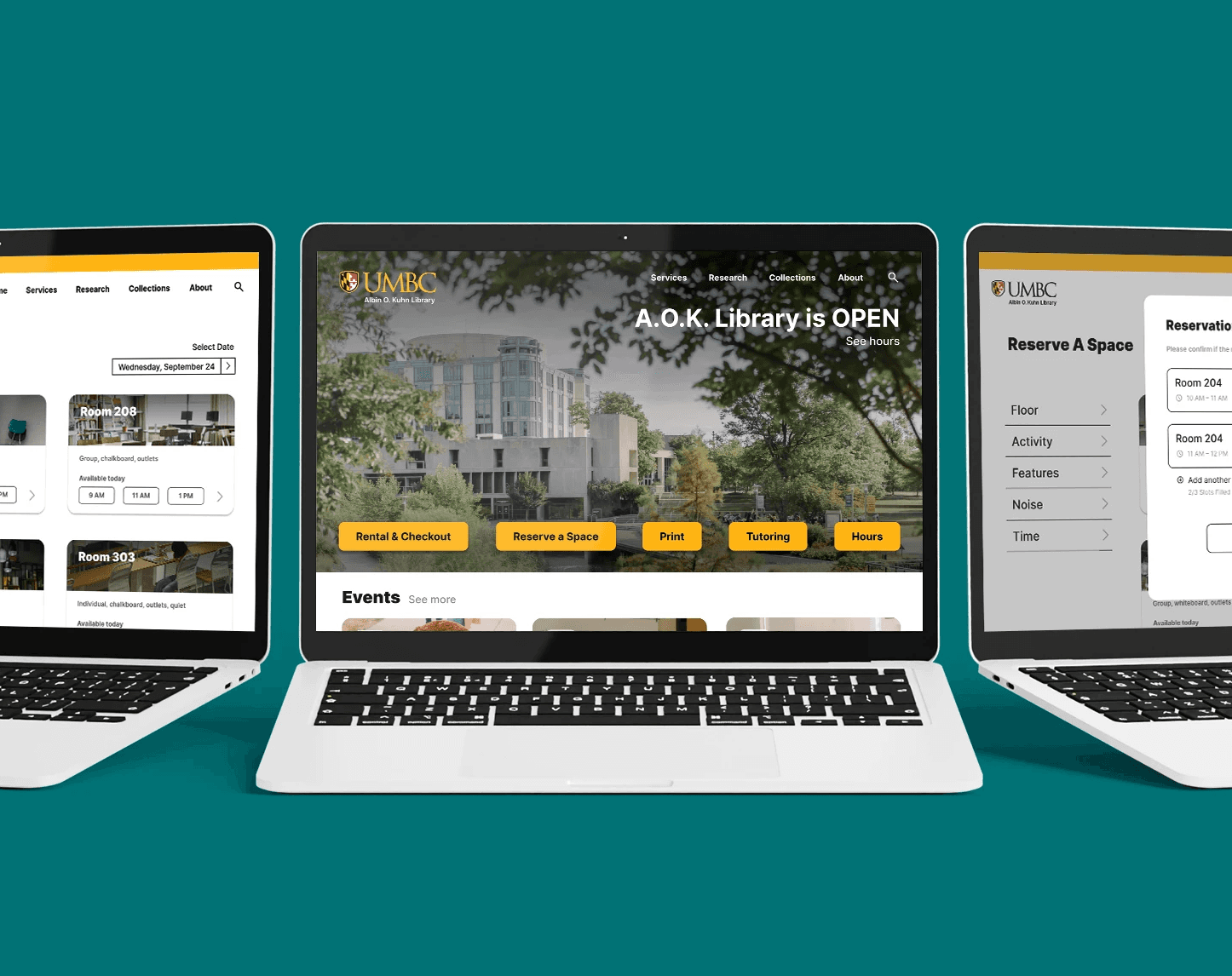
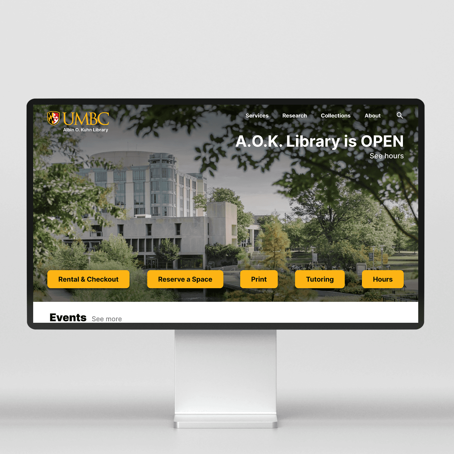
Med-Fidelity
The medium-fidelity incorporates color, images, and text to define clearer pathways. Users are presented with precise keywords and interactions that encourage discoverability and limit confusion. When reserving a space, users are guided in a shorter, clear-cut process that allows for backtracking and quick reservations.
Check out the medium-fidelity prototype:
Improvements
Strengthening information hierarchy through text and grouping
Simplifying search bar and placing in top menu
Increasing readability of popular user actions
Adding a clear filter area for room reservations
Significantly decreasing interactions needed to reserve a room
Establishing interaction consistencies
CONCLUSION
Our redesign created a clean and consistent step-by-step process to reserve study spaces, while also decluttering the landing page and increasing discoverability of the site.
Challenges and What We'd Do Differently
Broaden project goals to cover more paths and pages of the site
Widen interview and user testing numbers to heighten research results
Increase timeline and project team
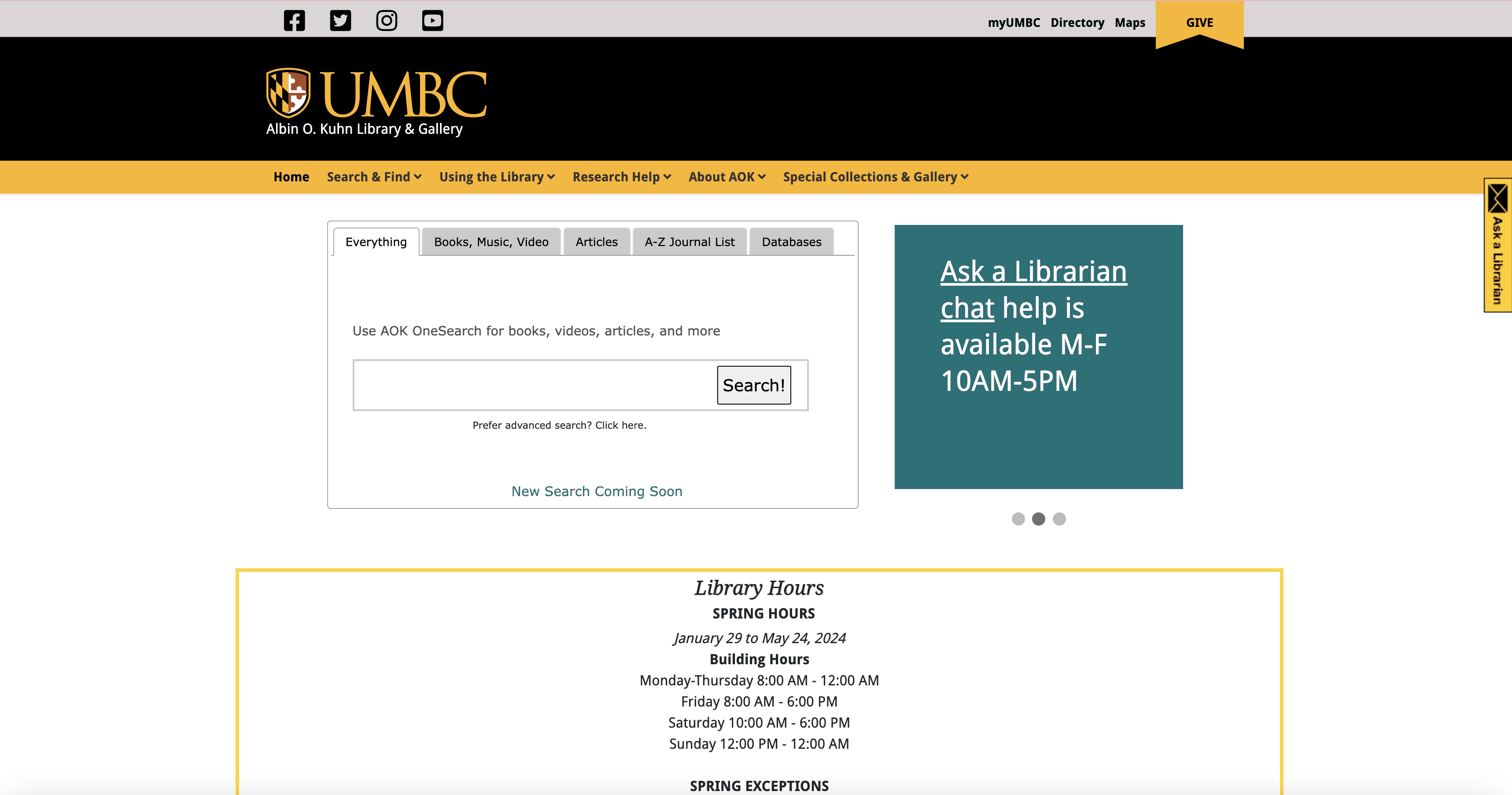
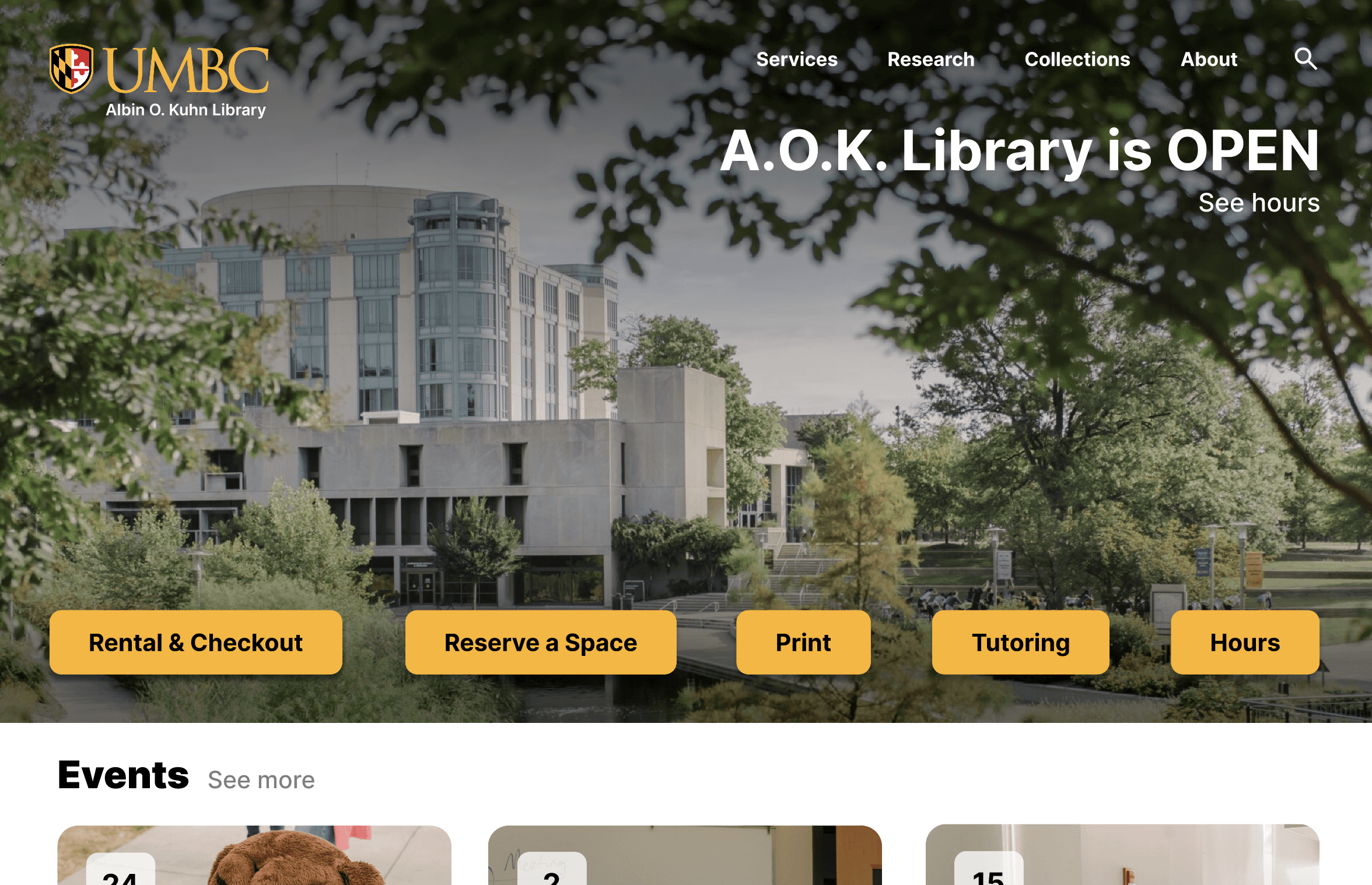
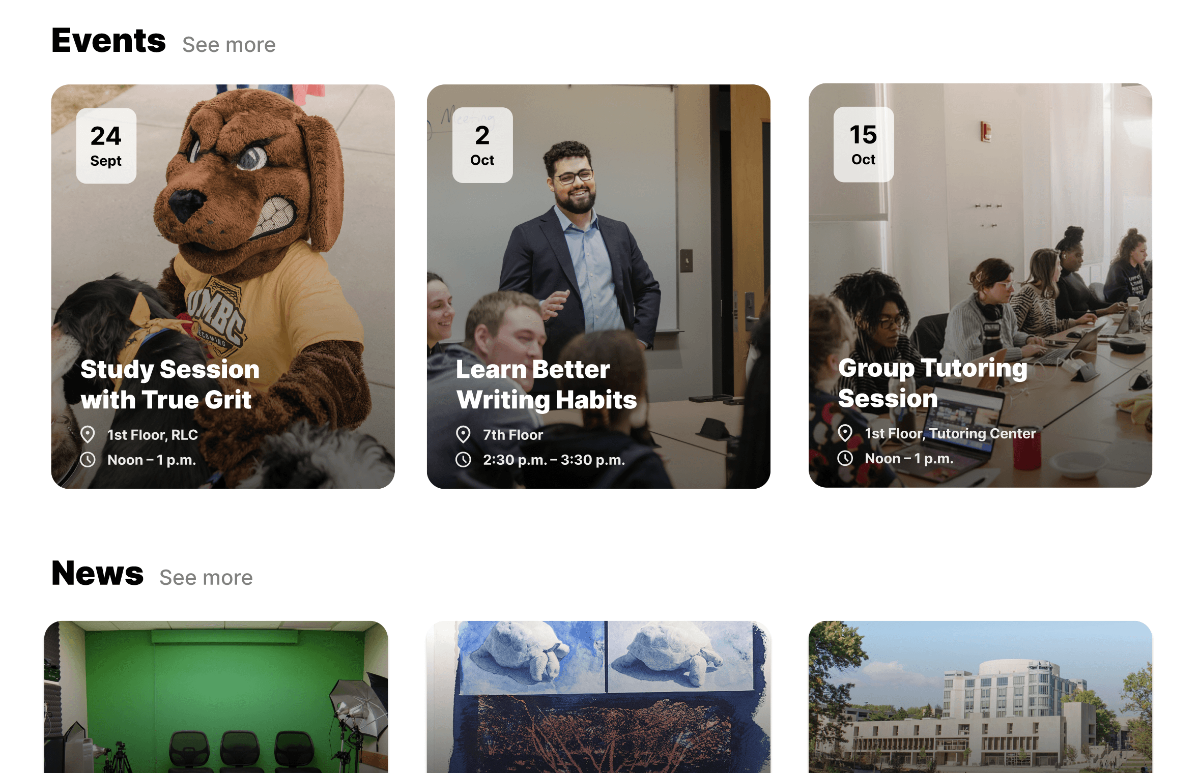
CHANGES
Original Landing Page
Redesigned Landing Page

Original Events
Original Events
Redesigned Events
Redesigned Events
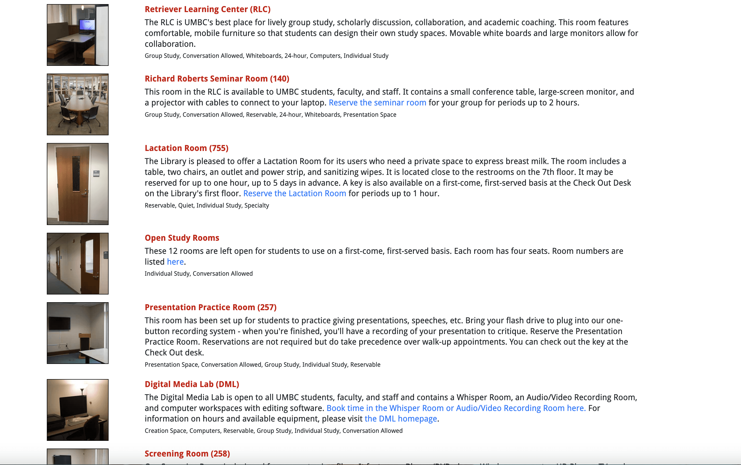

Original Room Information
Original Room Information
Redesigned Room Info Cards
Redesigned Room Info Cards


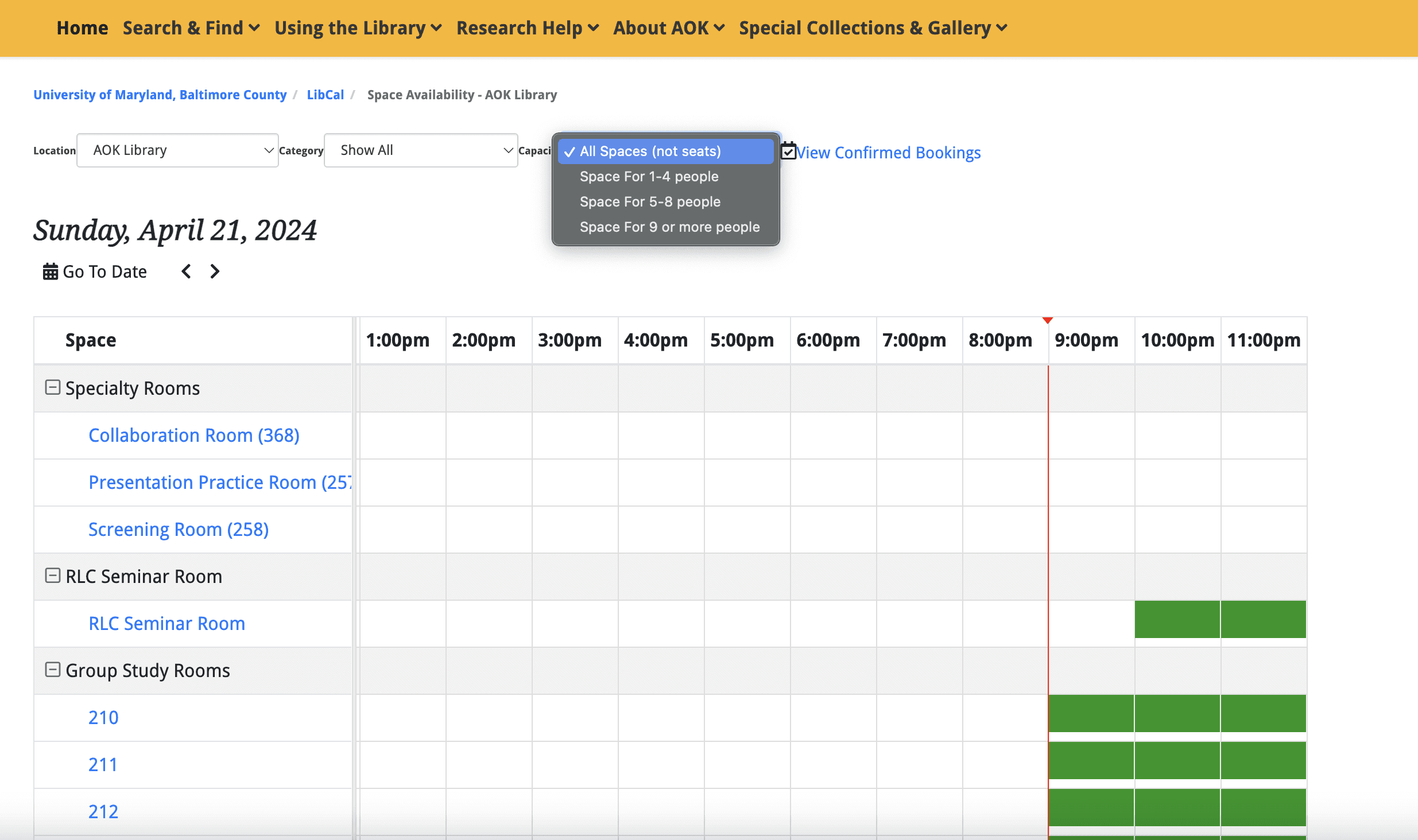
Original Reservation Grid
Original Reservation Grid
Redesigned Reservation Page
Redesigned Reservation Page

Original Filter Drop Down
Original Filter Drop Down
Redesigned Filter Drop Down
Redesigned Filter Drop Down
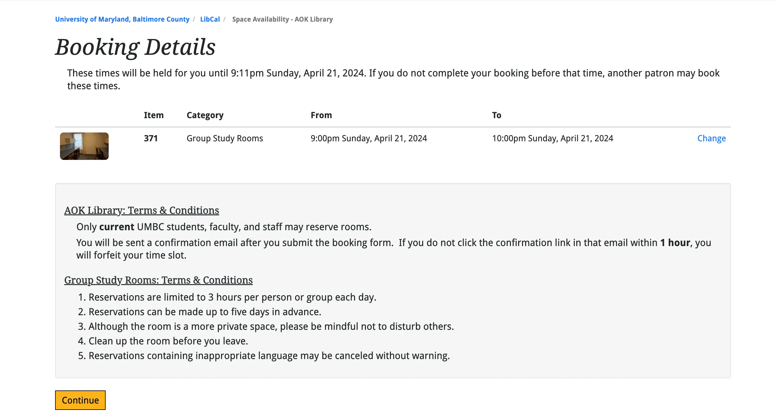
Original Confirmation
Original Confirmation
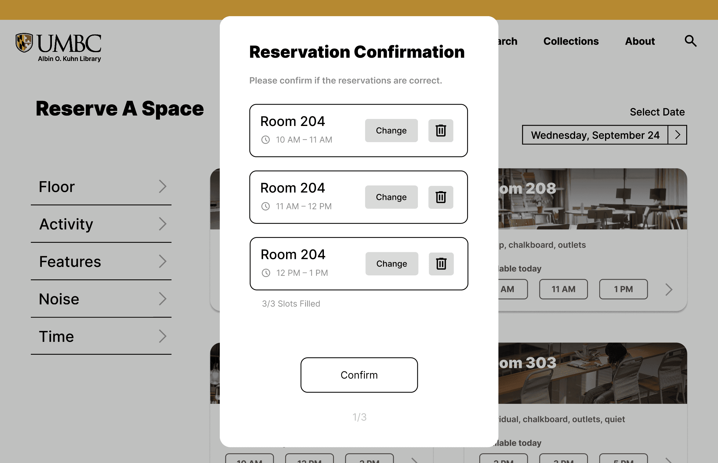
Redesigned Confirmation
Redesigned Confirmation