


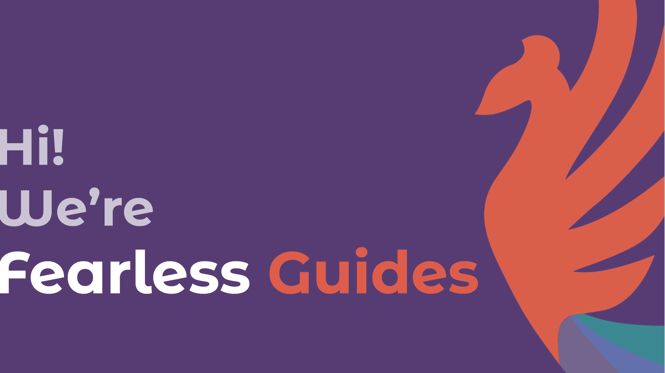
Background
Guides operates as a consulting subsidiary under Fearless. Users frequently encountered difficulties locating Guides' services within the broader Fearless site, leading to confusion and friction. To address this, I designed a dedicated website for Guides that effectively articulates their identity, mission, and service offerings, while providing a clear and intuitive path for users to initiate contact.
To help communicate their value, I also developed a suite of materials, including a pitch deck, slick sheet, and LinkedIn profile and headers.
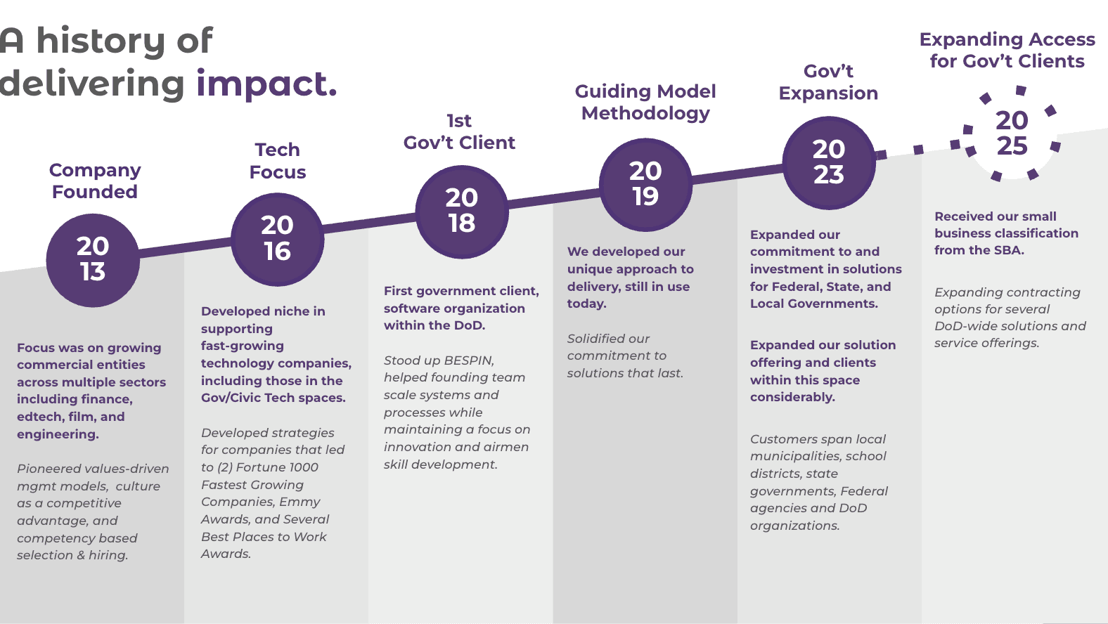
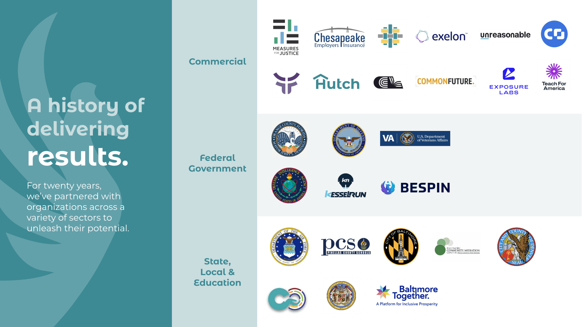
Pitch deck
To strategically elevate their market presence, I developed a pitch deck designed to clearly articulate their unique value. I built upon their existing branding, thoughtfully evolving it to differentiate Guides from their parent company and create a compelling narrative that resonates with potential clients.
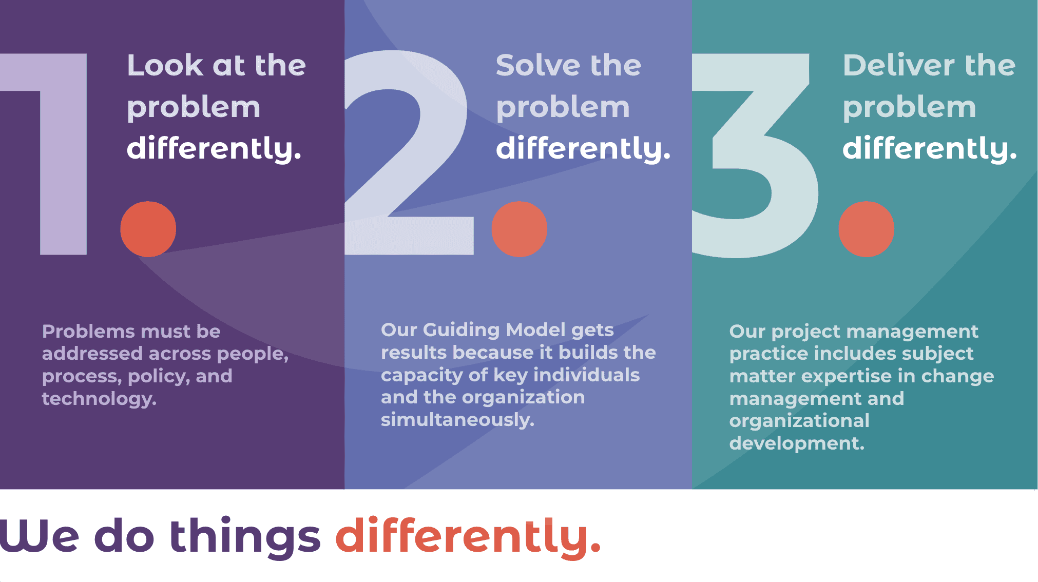
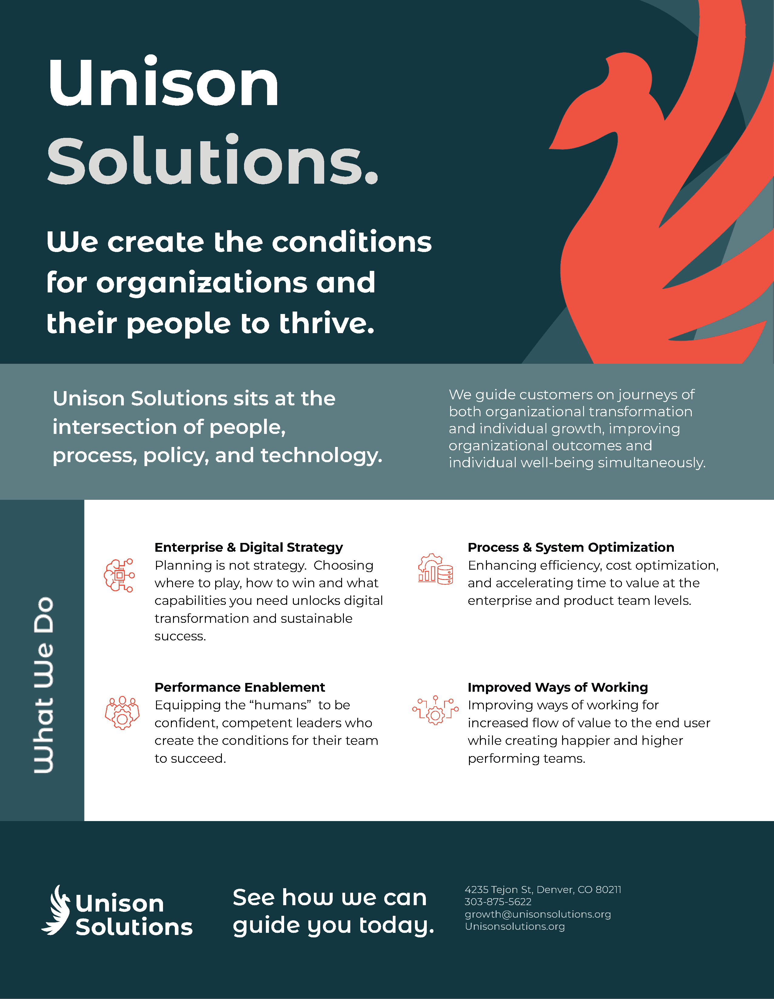
Slick sheet
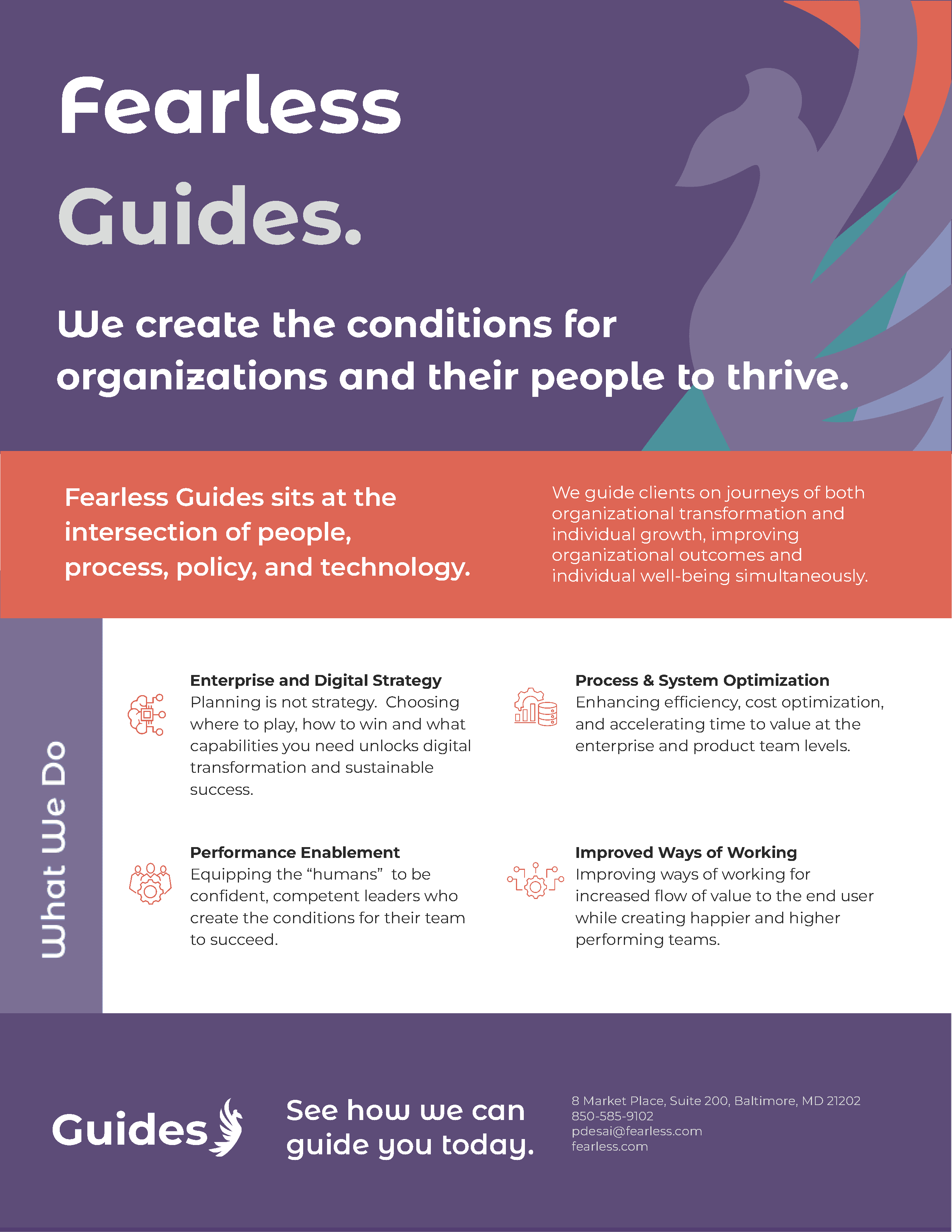
Guides needed a streamlined, one-page overview to share with potential clients, a slick sheet, that markets their services at a glance. I designed the piece with a clear visual hierarchy, ensuring their mission and key offerings were immediately visible and easy to digest, making it an effective tool for outreach and first impressions.
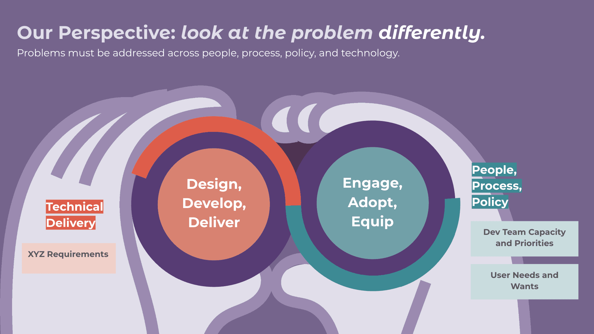
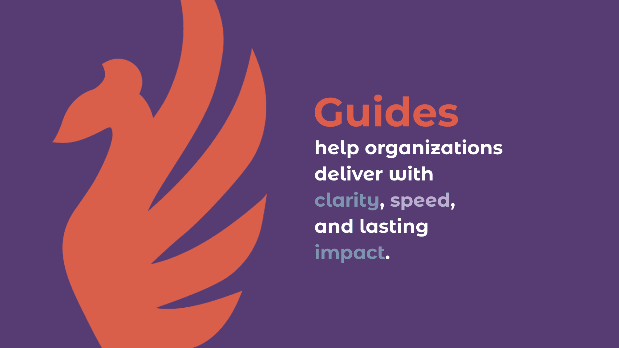
The foundation
To establish a solid foundation, I developed a comprehensive wireframe of the entire site, outlining key interactions, visual elements, copy placement, and identifying areas requiring content development. Concurrently, I conceptualized a fluid landing page design during discussions, which served as an inspirational framework for subsequent design iterations.
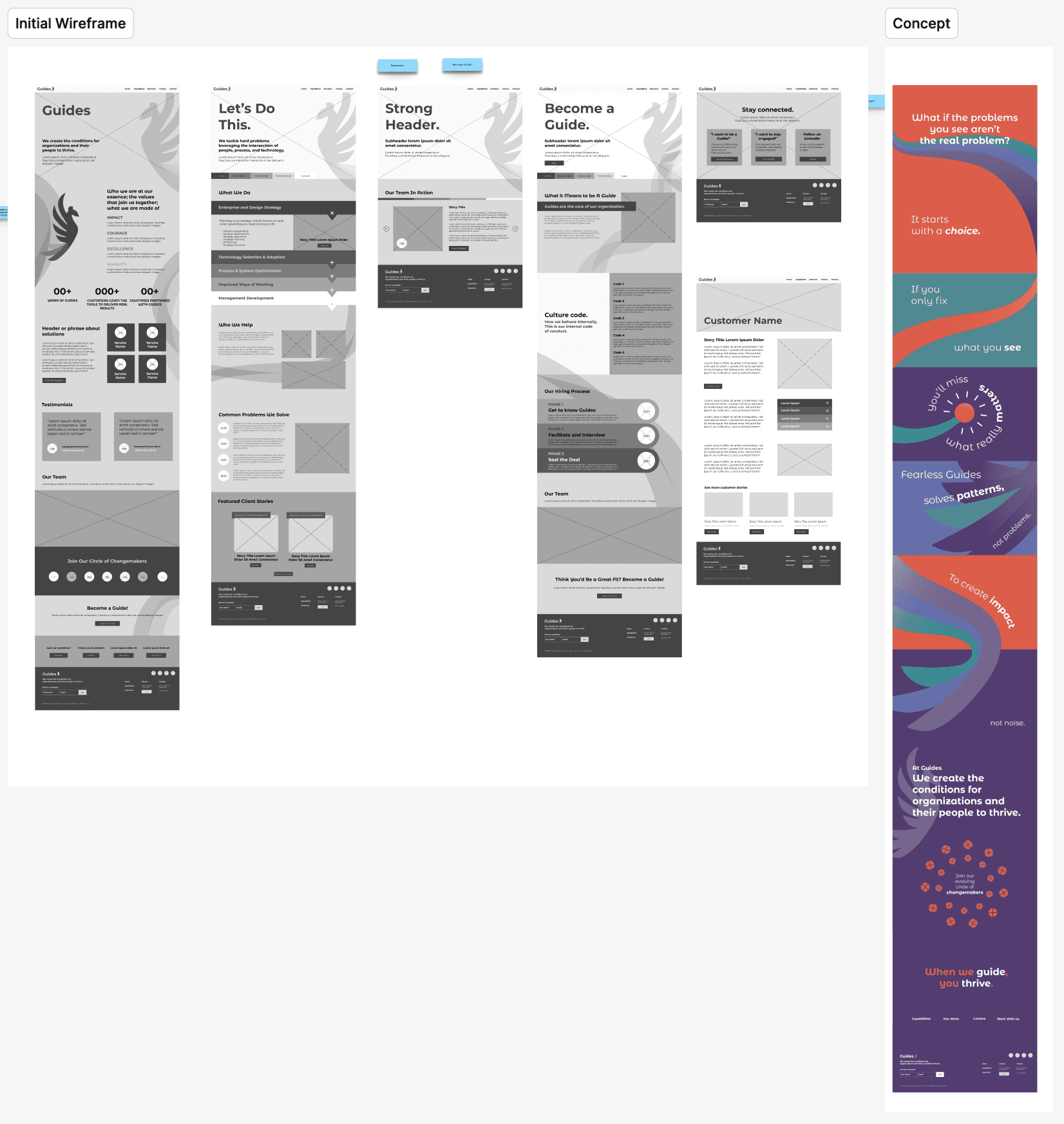
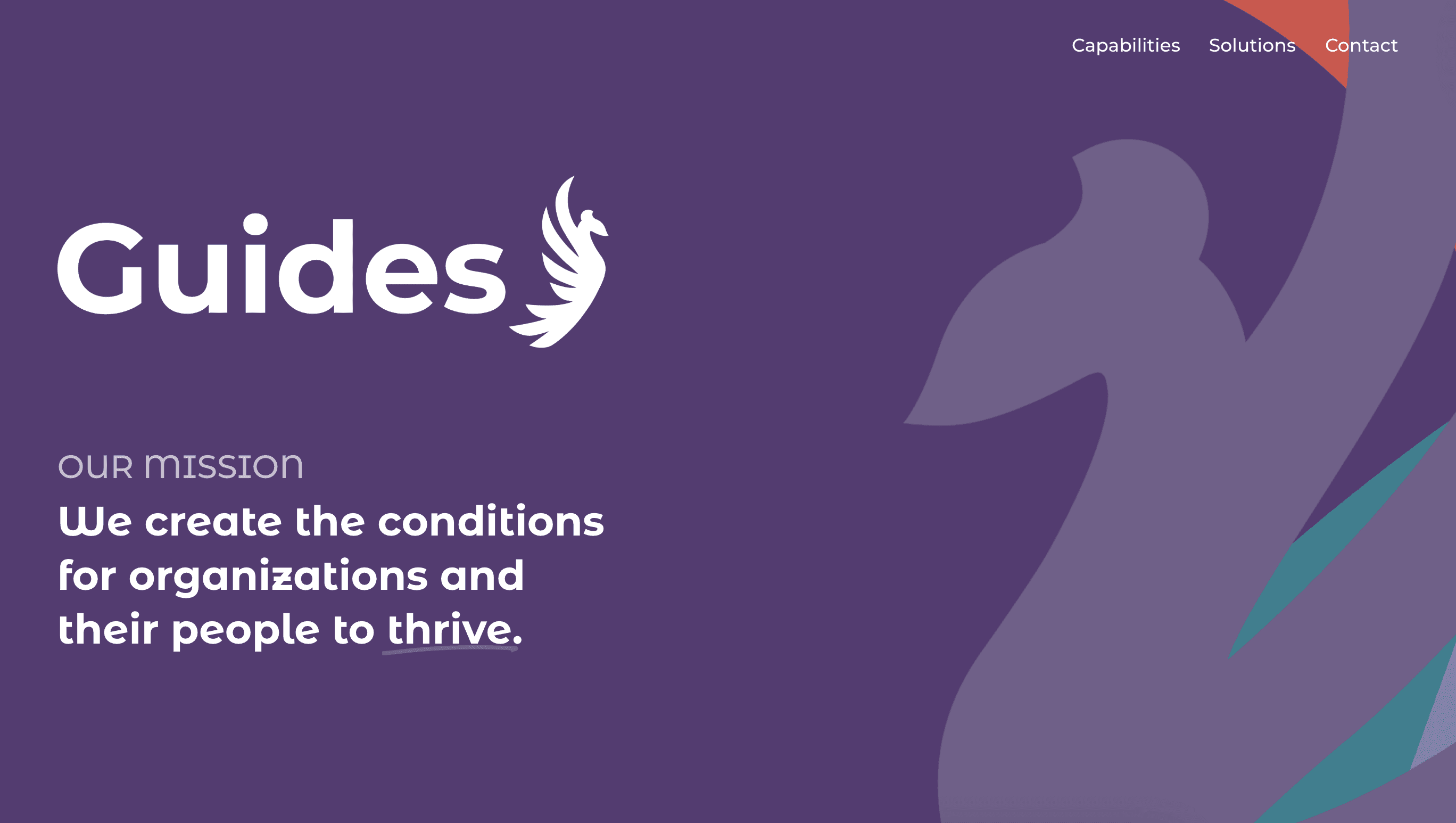
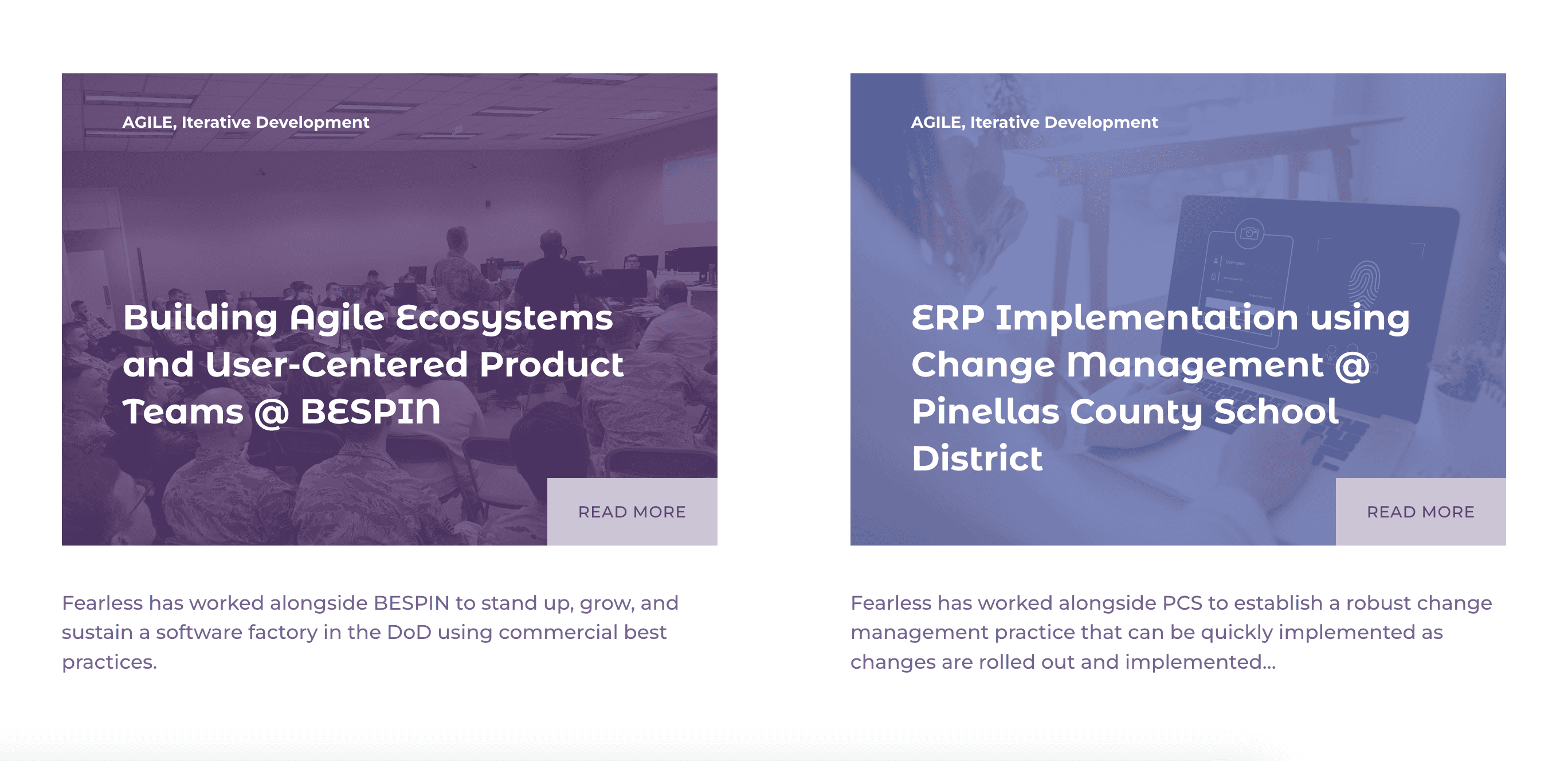
The original
The wireframe guided the development of an interactive website in Squarespace. Through an iterative design process, the site continues to evolve to accurately reflect the brand and expand Guides’ digital presence. The following are some initial screens before the rebrand.

Switch it up!
Before the website launch, Guides faced an unexpected rebrand. I jumped in to define the full project scope, establish a timeline and budget, sequence deliverables, and get the work underway.
Recolor
Unison Solutions had two months to initiate a rebrand ahead of their first public introduction. With a limited budget and timeline, I proposed a phased approach, starting with a strategic recolor of the existing brand palette and applying it to core assets such as the website and logo.
I explored multiple primary palette options, evaluating their interaction with secondary colors and aligning with the existing color usage system (100%, 80%, and 30%). Palettes were applied directly to logos and page layouts to ensure consistency and legibility, and all color combinations were tested against WCAG 2.2 standards to confirm accessible contrast and define necessary usage constraints.

The Phoenix Ascent
The final palette, the Phoenix Ascent, establishes teal and its variants as the primary colors, with the legacy Guides orange elevated as a key accent. This contrast strategy draws focus to the warmth and vibrancy of the phoenix mark, highlighting its oranges and reds, while reinforcing a more polished, professional visual presence for Unison Solutions.
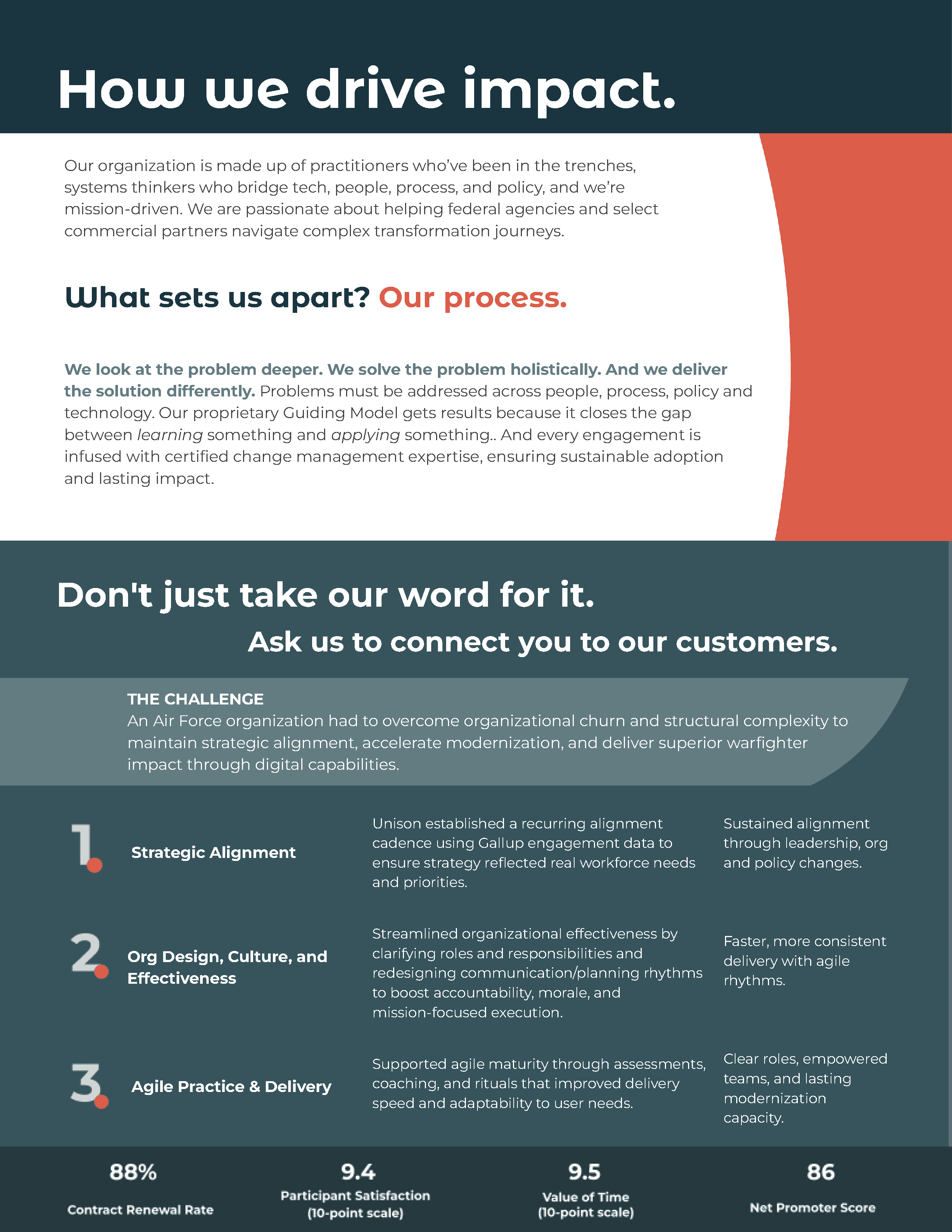
A fresh coat of paint
The capabilities sheet was refreshed with the new color palette, establishing consistency across brand touchpoints and readiness for client-facing marketing.
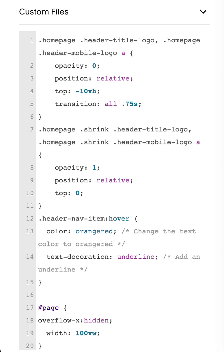
Custom CSS
Using Squarespace’s custom CSS capabilities, I enhanced the website’s usability, visual feedback, and overall sophistication by implementing the following:
• Hover state (underline) for top menu item selection
• Top menu background drop down upon scroll
• Horizontal scrolling logo sequence (landing page only)
We're live!
